Design Principle: Proximity
Proximity is the design element of putting related information close together, while separating the less related information, making it easier to find things that you are looking for on a page. proximity can work with many different entities, like for example, putting a caption close to apicture so that they are easy to read.
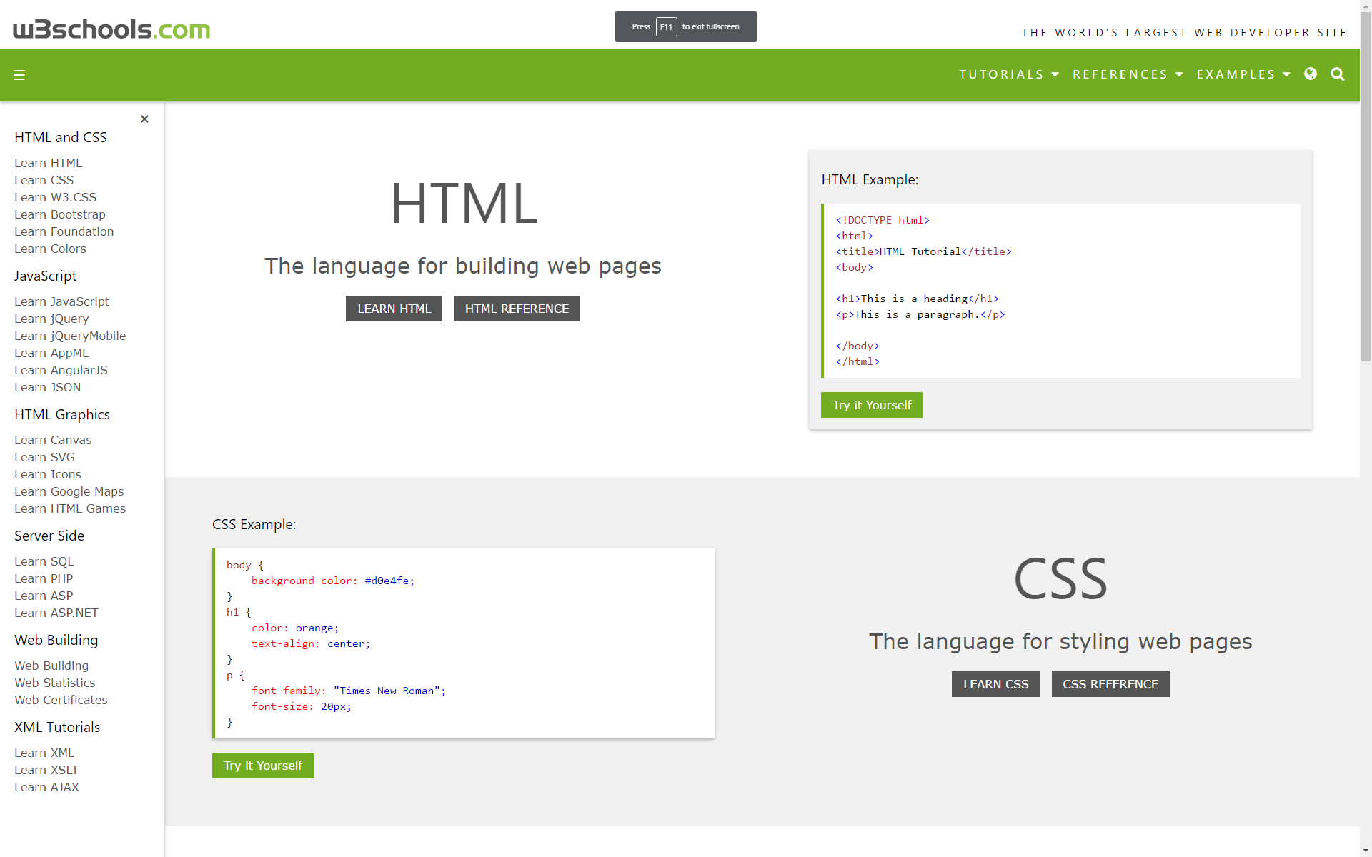
Example Website: W3schools
Here is a site that I think has applied the concepts of proximity correctly. you can see how there are large portions of the page labeled "HTML" and "CSS" that each have relevant information nearby. also if you look on the far left, there are subheadings that have more information, each grouped accoring to which heading the information is about.
Design Principle: Alignment
Alignment is the design element of setting up a page so that it follows invisible lines, making it easier to read, and appear more appealing. with alignment, you should be lining up everything on "invisible lines" which stay consistent throughout the page.
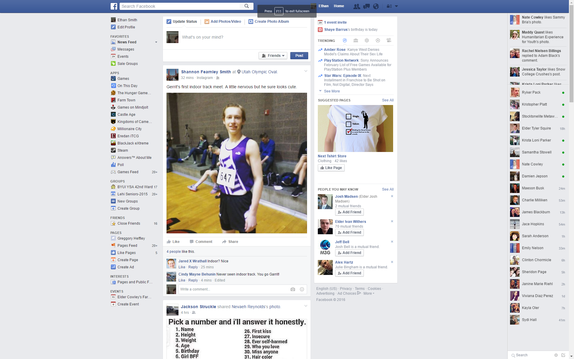
Example Website: Facebook
I think that facebook is a great example of alignment, especially vertical alignment. everything fits very specifically on a page, in it's certain page, so that even as you scroll, the sidebars remain the same. I think this looks very aesthetically pleasing, using alignment on a site that is also very fluid, based on how you scroll.
Design Principle: Repetition
Repetition is the use of design elements to tie together your website and other media in such a way as to create familiarity and recognition. Companies and advertisers use repetition so that viewer will not only recognize their site but also be able to easily access the information that they are looking for because it is organized in the same way throughout.
There are six basic areas that one can begin to use repetition in these are:
- Headings and Subheadings
- Colors
- Layout/Rules
- Images
- Graphical Elements
- logo
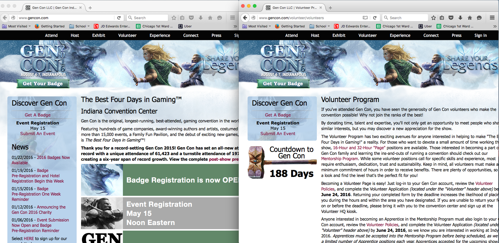
Example Website: Gen Con 2016
A good example of this design principle in use can be seen in the website for Gen Con 2016 a national gaming convention held in Indianapolis Indiana. This website demonstrates a number of design principles but it is really good at repetition each page of this website has the same banner across the top of the page with the Gen Con Logo in the upper left corner of the page. The color scheme of icy blue, white, green and burgundy repeats through out all the pages. The Count down logo (Thors Hammer) is repeated on each web page as well. All the web pages are divided into four sections the main navigation banner at the top, the secondary navigation banner on the left side, The central display in the middle and a footer section at the bottom. All the images are of Norse/Artic style.
Contrast
Contrast is the difference between two elements. This can be black and white, thick and thin, big and small, or fast and slow. On a web page you want contrast. Contrast can make something stand out or attract attention. Poor contrast on text can make it difficult to read. Poor contrast can make your elements blend in and make the page plain.
Types of contrast
- Color
- Size
- Texture
- Shape
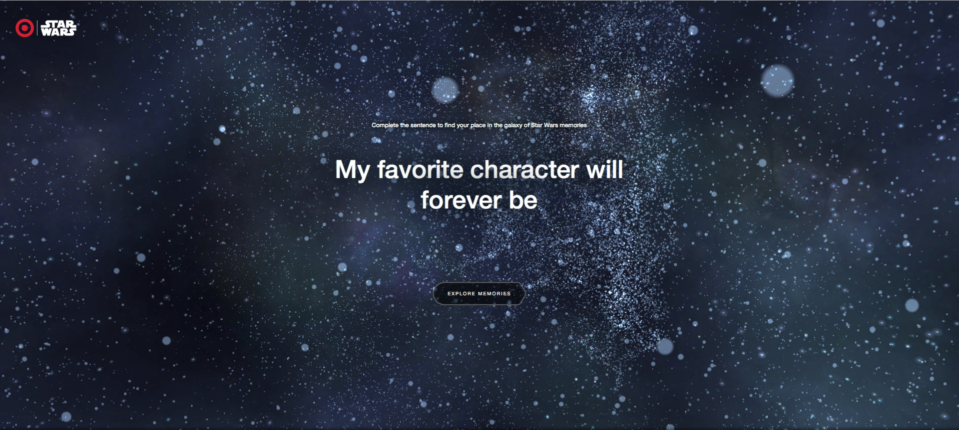
Example Website: Share the Force
A good example of using contrast wisely is at https://sharetheforce.target.com/hub . This page uses large white font on a dark background. It makes it easy to see and read the text as well as standing out and focusing attention. The favorite character you type in is also underlined by a color that represents that character and brings attention to your choice.
Typography

Example Website: The Color Run
Here is a site that I used to work on doing search engine optimization at a previous employer. I like what our designers did with designing some of these slides, because it conveys to me the reader, that it's a very fun and colorful race. The bright neon-esque colors run into each other in a path to emulate the feeling of a path, in addition to use of negative space for the word "MOVEMENT". They purposefully put the text at a slant towards to the bottom to give the illusion that it is on the move, utilizing the non existent 3D space on a 2D page. The fonts as a whole are very playful, yet all in bold and allcaps. They use very colorful pictures in conjunction with the font and typographic design of the colorful path that leads to the words "MILES FOR MEALS MOVEMENT". I find this image, and their whole site as a great example of modern typographical implementation to catch the reader's eyes and attention.
Team Members Assignments and Home Websites
- Proximity - Ethan Smith
- Alignment- Ethan Smith
- Repetition - William Murray
- Contrast - Jed Hawkins
- Typography - Braydon Hord